Branding for UTIHP
May 20, 2011
Identity created for University of Toronto International Health Program.
The client wanted a fresh new image but still retain their roots and established tradition. This was accomplished by the associating the organization with the oak leaf, a symbol of the University of Toronto. A snake wraps around the vein of this UofT leaf to communicate the symbol of health. The atmospheric crescents and cardinal points on the outside form people extending arms in lieu of the global community and cooperation. Utihp.ca
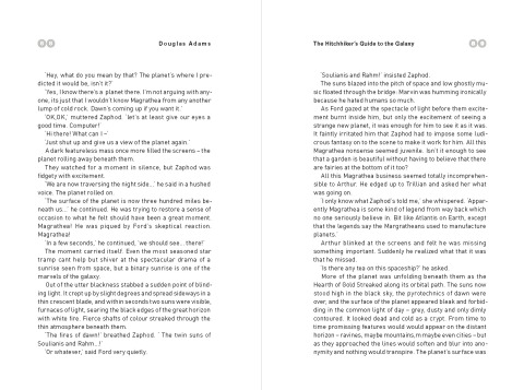
Hitchhiker’s Guide to the Galaxy Book Design
April 12, 2011
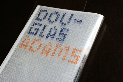
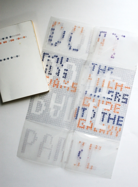
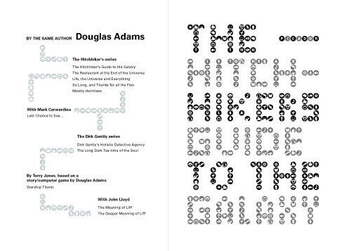
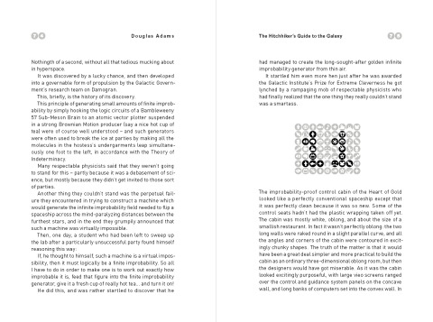
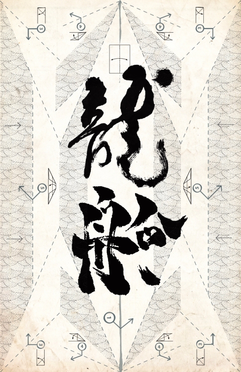
The design communicates themes found in the book regarding the incomprehensible vastness of the universe, and layers of information overload. The pixel characters forming the title are in fact made of many icons each representing a topic or theme in the book. When you fold the entire book jacket open, the catch phrase of the book DON’T PANIC is ironically revealed as another layer of information.
